

Hi, I’m May, and I love pretty things!!
A lot of compliments I get about my blog is that it’s pretty / gorgeous / nice to look at / some variation of those words. And while it DOES take a Good Eye to determine what looks nice or not (let’s just say my Eye has improved a lot from since I first started blogging), pretty much anyone can make a great blog design!
But I feel like when you’re a beginner blogger, you definitely have less of an idea of what you should do, and I personally feel like a little guide to it all might have been really helpful for me, so today, I made that for you guys!
I really hope you like this post or find it helpful! I tried my best to give good tips but it’s hard to tell you specifically how to make nice-looking graphics. But feel free to reach out and ask for my opinion/feedback on any designs you have if you want!!
1. DECIDING YOUR LOOK
This is the first step, because it is the Most Important. When I was re-designing my blog, I had to decide what I wanted my “look” to be. And by look, I mean:
- colors and how it adds to your “vibe”: do you want light colors that make your blog seem more cheery or darker colors that make your blog feel more sophisticated?
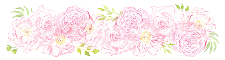
- I knew I wanted to make my blog pink and bright, so I found graphics based on that!
.
- I knew I wanted to make my blog pink and bright, so I found graphics based on that!
 objects that can be a part of your “brand”: surprisingly, mangoes is not what I’m talking about here; I mean actual objects in your design that could lead people to remember you
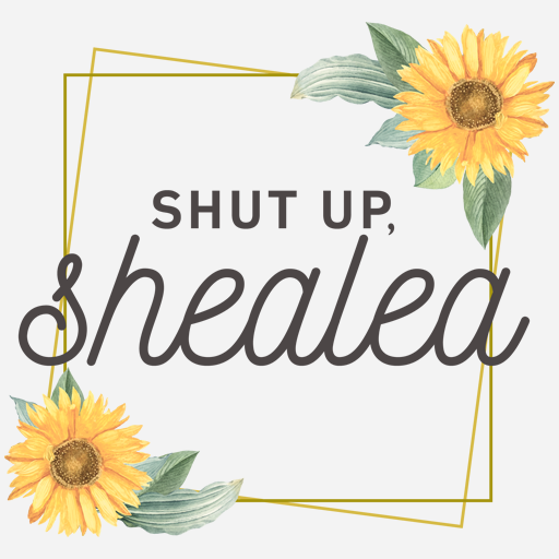
- mine are obviously the beautiful pink flowers, and another great example from the top of my head is Shealea @ Shut Up Shealea’s sunflowers!
.
- mine are obviously the beautiful pink flowers, and another great example from the top of my head is Shealea @ Shut Up Shealea’s sunflowers!
- your vibe!!: this is very important because you want to attract viewers to your blog and keep them there. do you want your viewers to feel happy when they see your blog? do you want to seem more sophisticated and professional? do you want it classy and simple or busy and bright?
- light = cheery, dark = sad is not always the case!! CW @ The Quiet Pond has a darker blue color scheme and combined with the whole idea of her blog, that color makes her blog feel all the more magical

2. FINDING GRAPHICS
Most blog designs I know are full of different visual things or objects, and if you can’t make them yourselves (god knows I can’t), there are a lot of different resources online where you can download them for free!!
One super common starter freebie site is Angie Makes. My personal advice is to stay away from it, because so many people use them that it’s become easily recognizable, but if you currently use these or want to, do it! Don’t let its popularity stop you—it must be popular for a reason!!
For some floral freebie graphics, there’s Gold and Berry and The Smell of Roses. For free graphics in general (as in not just floral), there’s Freepik, Creative Market, and Creative Booster, which have a selection of things you have to pay for, but also a selection of freebies!
Note: These are certainly not ALL the graphic resources out there! I can just name these off the top of my head, and I don’t have enough of a memory to conjure up other good sites—but they’re a great place to start at! (And sorry I don’t know more non-floral graphics sites; I love flowers a lot okay???)

THE most important thing about using graphics from online is how it is licensed. All graphics/websites will tell you whether or not it can be used for commercial use (in which you somehow profit off of the use of it) or personal use (in which you just use it for yourself, such as a blog). It will also tell you whether or not the creator needs to be attributed (credited). This is so important because you could face legal consequences if you do not obey these!!
If it says free for commercial use, it’s also free for personal use. And if it says attribution is required, make sure to link to the place you got the graphic from somewhere “stationary” on your blog, like in your footer (instead of in just one blog post, unless you use that graphic only in that blog post).
3. FONTS!
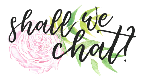
(When I say fonts, I mean fonts for use in different blog graphics, such as my header and “shall we chat?” graphic.)
Honestly, there isn’t much to say here. Pretty much the only thing I’ll say before linking to my favorite font resources is that whatever font you choose absolutely MUST be readable. It also should be pretty!!! And not an eyesore!!!! And I know what’s ugly or not is very subjective, but just make sure it’s not anything that makes your eyes HURT looking at them.
Examples of the types of fonts you want to stay away from (yes these are unrealistic and you would probably never consider using them for your blog but I have points to make):

(this is just… so glaringly BIG)

(I don’t even know what this is??? are you trying to do some geometry????)

(let’s play a guessing game!!! guess what tf this is supposed to say)

(I wanted to show this one because it’s something more along the lines of a lot of the brush fonts you would find used in blog headers: when using brush calligraphy fonts, it is SO important to make sure it’s easily readable. you want your viewer to see your blog title and instantly be able to read it; this font takes some time for you to discern the letters)
Here are some of my favorite fonts sites!! One of the things that I had to learn was how to actually access the font file after I’d downloaded it, and I legitimately could not tell you how I did it because I haven’t downloaded a font in so long?? (On PC I know it’s something with like unzipping a file… But I got my answers from Google, so you can too!)
- DaFont
- 1001 Free Fonts
- Urban Fonts
- FontSpace
- (no what are you talking about these are NOT the first four sites that pop up when you google “free fonts” I’m very unique and use obscure sites)
4. THE ACTUAL DESIGNING OF THINGS
This is where the magic happens: the place where you put all of it together!!
There are SO many different designing tips that I could give you, especially the tricks I learned by myself. But there are just too many, and many of them are small little things that you can find on your own by just playing around!
In general, I feel like giving tips and advice on the actual putting-everything-together part is super hard, because I can’t really to tell you how to make something look visually appealing?? But I will just give a few basic overall tips!!
- Keep it simple! Especially for blog headers, and especially if this is new to you. My blog header is literally just a few flowers/leaves with text on top! And it looks super pretty!! (And I can say that because it wasn’t designed by me.)
- examples of my favorite clean and simple but beautiful blog headers:


- Make sure any text you use is READABLE. Not the font (since I already talked about that!), but the colors and the size. Make it stand out, ESPECIALLY if it’s a blog header.
. - Balance things out! If you have both text and images/objects, you want to make sure it looks balanced. Don’t make your images too big, and don’t make your text too big. Don’t put too many images, and if you have a lot of text, add more images. If you have any white space, make sure it doesn’t look too empty. And symmetry is really great when it comes to balance!
. - Experiment!! Move things around and play with the look of things! Don’t be afraid to try new things—you might end up with something you love!
- I went through several variations of my divider before I stumbled upon my current one, and I’m super glad I kept playing around. These weren’t horrible (they’re just so very RED), but I love the one I have right now a lot more:


And here are some designing sites I recommend using for putting everything together, though there are many others!
- Canva (the only reason Canva is somewhat limiting to me is because you can’t use your own fonts, but I have used it a lot!)
- BeFunky (great resource but sometimes designs come out blurry)
- iPiccy (a bit hard to navigate but really great once you get it!)
Honestly, if you have some kind of design you’re making and want my opinion on it, feel free to just shoot me an email with an image of it attached! I love seeing others’ works of art, and helping to improve them, and I don’t mind offering feedback at all. (Definitely NOT going to design it for you, though!! I have No Time.)
5. BLOG LOOK!
Here’s where you incorporate everything above into your actual blog. Insert your blog headers! Use those sign-off graphics and beautiful dividers! Choose a theme you love—keep it clean, simple, and navigable. In my opinion, patterned backgrounds can be pulled off in only a few circumstances (such as a light-colored pattern), so stick to a solid color to play safe! A white background is my personal recommendation, and you’ll see it in a lot of blogs for good reason!
Some important things to your overall blog aesthetic:
- Clean! Simple! Readable! Those are probably the biggest things I look for in a blog design? Keep it simple and clean enough so I know what I’m looking at, and keep everything readable so I can actually read things on your blog! Make sure there’s nothing overwhelming or confusing going on.
. - Make sure it’s easily navigable. A pretty design isn’t going to do much if you have no idea how to navigate the blog. Draw me in with your beautiful blog, and then make sure I can find my way around it!!
. - Good sizing is important! In my opinion, the only reason you should make anything big is to see detailing, such as on headers that you (somehow) managed to draw yourself. Anything really big is going to feel really blown up in your viewers’ face. But also, don’t make it small to the point that you can’t see it! Find that perfect middle ground.
GENERAL TIPS
Here are a few bits of overall advice when designing your blog!
- COLOR SCHEMES. If your blog theme offers a purple text color, but your graphics are in orange, it’s going to clash and not look good at all. My color scheme is pink and pink!! It goes Very well together.
. - The font of your post’s text is also super important to the look of your blog. Don’t choose an ugly one!! Please!!! If I hate the how the words of your post look, I’m NOT going to read them. And yes, “ugly” is subjective, but in general, stay away from fonts that are hard to read and keep it simple.
. - Keep a theme. If you have some kind of food shown in your blog header, but then every other graphic you make includes animals and not food, it’s not going to be very cohesive. (And I definitely would be wondering why you didn’t include food in your other graphics??? Food deserves better than that.)
. - Be original. You can be inspired by so many other bloggers’ beautiful designs, but it’s so important to be creative and come up with your own things. 1) You should not steal and plagiarize and copy from anyone, for moral and legal and just basic human decency reasons, and 2) you want to be unique and stand out from other bloggers! Have a design that makes people remember you.
how do you design your blog? do you do the same steps as me? what kind of resources do you like to use? what are Your biggest tips for blog aesthetic??

78 thoughts on “How to Get Started on Making Your Blog Look Pretty: A Mini Blog Design Guide by Me, a Somewhat Okay Designer”